Manage Docs Contact With Beacon
Beacon is built into Docs, making it quick and easy for your customers to reach out via email or live chat if they need more help. AI Answers is built right in as well, allowing visitors ask the AI for help first!
This article will help you enable and customize the Docs site Beacon.
In this article
| Permissions & Plans Access | |
|---|---|
| Plans With Access | All Plans |
| User Role & Permissions | Users with the Docs: Create new, edit settings and collections permission |
Enable the Docs Site Beacon
Head to Manage > Docs > [Choose your Docs site] > Beacon. Toggle Enable Beacon on and click Save.

The default Beacon widget with a contact form will show on your Docs site now. You'll also see a Contact link appear in the top navigation of your Docs site, and a note at the end of each article with a link to contact you — these links will now open the Docs Beacon for your visitors to reach out.

Clicking any of these links or the Beacon itself will show your visitors the Beacon contact form.
If you change your mind, just toggle the Enable Beacon switch to off and click Save to remove it.
Customize the Docs Site Beacon
You can customize the look and feel and some options for the Docs site Beacon, including offering live chat. Click Customize Beacon to explore these options.
The Docs site Beacon will not appear in the regular Beacon admin pages. You can only access the settings for a Docs site Beacon through this menu.
Look and Feel

-
Name and Color
By default, the Beacon will be named the same as your Docs site. This is an internal only name that customers will never see, but if you'd like to change the name you can do so here. Change the color of your Beacon on Docs by clicking the color square next to the name and choosing a color from the color chart, or type in a color hex code.
-
Language
Choose the default language for all labels in Beacon. If the language you wish to use is not in this list, you can translate each label separately in the Customize labels section below.
-
Button style
Choose whether you want the button to be an Icon, Icon & Text, Text only, or Hidden. Choose which button style to use and/or enter the text you want to use after selecting the style option.

Choosing Hidden means that the Beacon will not appear at the bottom of every page, but will open when visitors click any of the contact links.
Advanced

-
Horizontal position
Display the Beacon on the left or right side of the page.
-
Z-index
If you are using any custom CSS with Docs and find the Beacon isn't fitting just right, you can use this to alter the z-index value to change the stack order of Beacon so that it’s not bumping into other elements on the page. There’s no minimum or maximum value, and you can use negative values, too. If you've worked with a developer to build custom CSS, reach out to them for any guidance on what this needs to be set to for your custom CSS.
-
Help Scout logo (Plus and Pro plans only)
Plus and Pro plan customers can toggle Help Scout branding on the Beacon on or off. A small Help Scout logo appears on the bottom of the Beacon window when this is toggled on, or for Standard plan customers.
Customize Labels
Specify your own text for each label to match your brand and voice; customize just a few or all of the labels as you wish! Click each header to expand and view all the labels in each section.

Contact Options
Click Contact on the left navigation menu to make changes to the contact form or turn on live chat.
Messaging

-
Connected Inbox
Choose which Help Scout inbox the emails and chats will go to from this Beacon.
-
Show contact form
You cannot disable the contact form. If you no longer wish to show the Beacon, head back to Manage > Docs > [Choose your Docs site] > Beacon where you can toggle the Beacon off.
-
Show chat
Toggle on to allow chat through your Docs site Beacon. Scroll down to find the Chat options later on the page after you toggle this on.
Contact Form

-
Ask for a name
Ask visitors to provide their name when they use the Beacon contact form. When you enable this field, it is a required field on your contact form.
-
Ask for a Subject
Ask customers to provide a subject when they use the Beacon contact form. When you enable this field, it is a required field on your contact form.
-
Allow attachments
Allow customers to upload images or attach files when sending a message through the contact form. The maximum file size for any single attachment is 10MB. Customers can attach up to 3 images or files per message.
-
Show Custom Fields
Customers on the Plus or Pro plans can show up to five custom fields on the Beacon contact form. We use the same field names you see when viewing a conversation in Help Scout. If you display custom fields to customers, we’d recommend using customer-friendly field names.
If a custom field is required in the inbox, it is required on the Beacon contact form.
Chat

-
Satisfaction ratings
Enable or disable the option for customers to rate chats. Read more about chat ratings: Gather Feedback With Chat Satisfaction Ratings
-
Email transcript
Enable or disable sending a transcript to the customer when the chat session has ended.
-
Require email?
Enable or disable requiring an email to start a chat.
AI Answers
NEW Harness the power of AI Answers right in your Docs site!

For more information on AI Answers, check out the AI Answers category in our Beacon collection.
Use a Link to Open Beacon from Articles
You can add a link in your articles to create a call to action to reach out to your team or send your visitors to a guided AI Answers session; you'll just need to add a bit of code to the link to allow it to work everywhere.
Add an HTML block in the Docs editor, and use it to add text around and including the link.
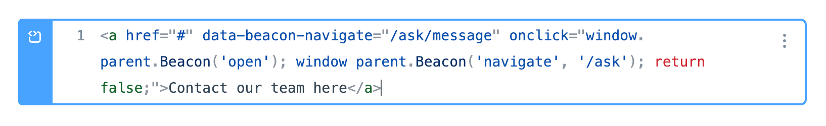
The snippet below will open the Beacon to the Ask > Email screen when your visitor clicks on Contact Us.
This link will work in articles both on your Docs website and when being viewed in other Beacons that serve Docs.
<a href="#" data-beacon-navigate="/ask/message" onclick="window. parent.Beacon('open'); window parent.Beacon('navigate', '/ask'); return false;">Contact our team here</a>
And this is how that will show up in the Docs article (click the link to see it in action!):
ℹ️ Note that you'll need both the JavaScript and the data-beacon-navigate attribute to be present in the link for this to work in both a Docs site and a Beacon serving Docs.
There are two data attributes that can be used here that will work in Beacon serving Docs:
data-beacon-navigate="/$PATH"allows you to use the Beacon JS method navigate, as documented here: https://developer.helpscout.com/beacon-2/web/javascript-api/#beaconnavigate-routedata-beacon-ask-question="[question to send to AI Answers]"allows you to make the click send a question you specify to AI Answers in the Beacon, as documented here: https://developer.helpscout.com/beacon-2/web/javascript-api/#beaconask-question-question
You can customize that link a little further if you like, using the Beacon JavaScript API for use in Docs site. You'll need some knowledge of how to work with JavaScript to customize it, and these advanced options will not work when viewing Docs served in Beacon, but there are other options that can be useful for tracking contact from Docs!
💡 Pro-tip: Ask our AI Answers here in Docs or in the Help Scout app to help you create the code link if you're not sure how to do it. Click here to ask AI Answers for a link that prefills the subject as an example!